Judging Your Book Cover… By Its Cover
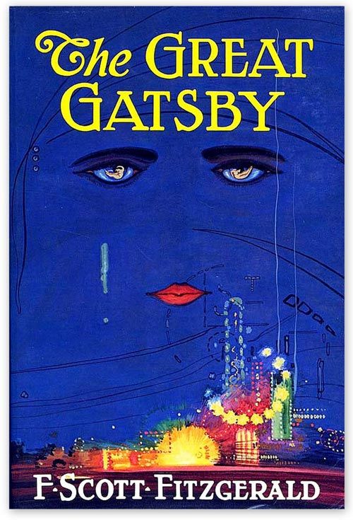
Perhaps the single most important marketing tool for your book is its cover. An effective cover draws a person to want to learn more about your book; a poorly designed one can turn off a potential buyer before they even read your book’s description.
The elements of an effective cover are:
TITLE AND AUTHOR: The title of your book and your author name should be the most prominent features of your cover, large enough so that they can be easily read even in thumbnail size. (See any book’s Amazon listing as a guide, ideally on a Smartphone screen.)
ARTWORK: The cover design should capture the book’s subject matter and tone (romantic, thrilling, scary, etc.), while also capturing the reader’s attention. But don’t make it too busy or visually confusing. Some of the most successful cover art is minimalist in approach—a simple figure (e.g., a mysterious woman in silhouette) or an object (e.g., a smoking banana) that best represents the work might be all it needs.
IMAGE QUALITY: The cover image(s) and text must be easy to discern, not blurry or pixelated. It should be created at a high enough resolution, ideally 300 dpi. It should also not appear ‘cheap’ (book price notwithstanding). Avoid substandard, fake-looking photoshopping. If your cover is illustrated, the artwork likewise should look professional (i.e., not like your middle school-aged nephew sketched it in his notebook during biology class).
COLOR: Unless it’s a sound aesthetic choice, your cover should be in color, or at least have more color besides black and white. That said, a color cover should also look good on b&w ereaders.
Some authors, in order to reduce expenses, might be inclined to design their own covers. Unless you truly possess the skills to do so, you should seriously consider hiring an experienced graphic designer to perform this task. While it may cost you a couple hundred dollars or more, it’s well worth the investment. Your cover art is your book’s first impression. Don’t make it a bad one.
